Timeline of American Beer Design: Styles, Eras, and Shifts
From the start, brewers have relied on creativity to make their drinks stand out. Ancient makers used catchy names and far-off places to spark curiosity. By the 1800s, as printing technology advanced, beer began to take on a new look through bold signs, colorful labels, and other eye-catching designs.
Beer is itself a product of design—recipes carefully crafted and guided through a complex process. In the 19th century, when most beer was local, labels became a way for brewers to prove their authenticity while celebrating tradition.
These labels also reflect their times. Optimism, rebellion, nostalgia, conservatism, even upheaval—wars, Prohibition, and cultural shifts all left their mark. Look closely, and beer labels tell us as much about history and culture as they do about what’s inside the bottle.

Pre-1880 or Before The Label
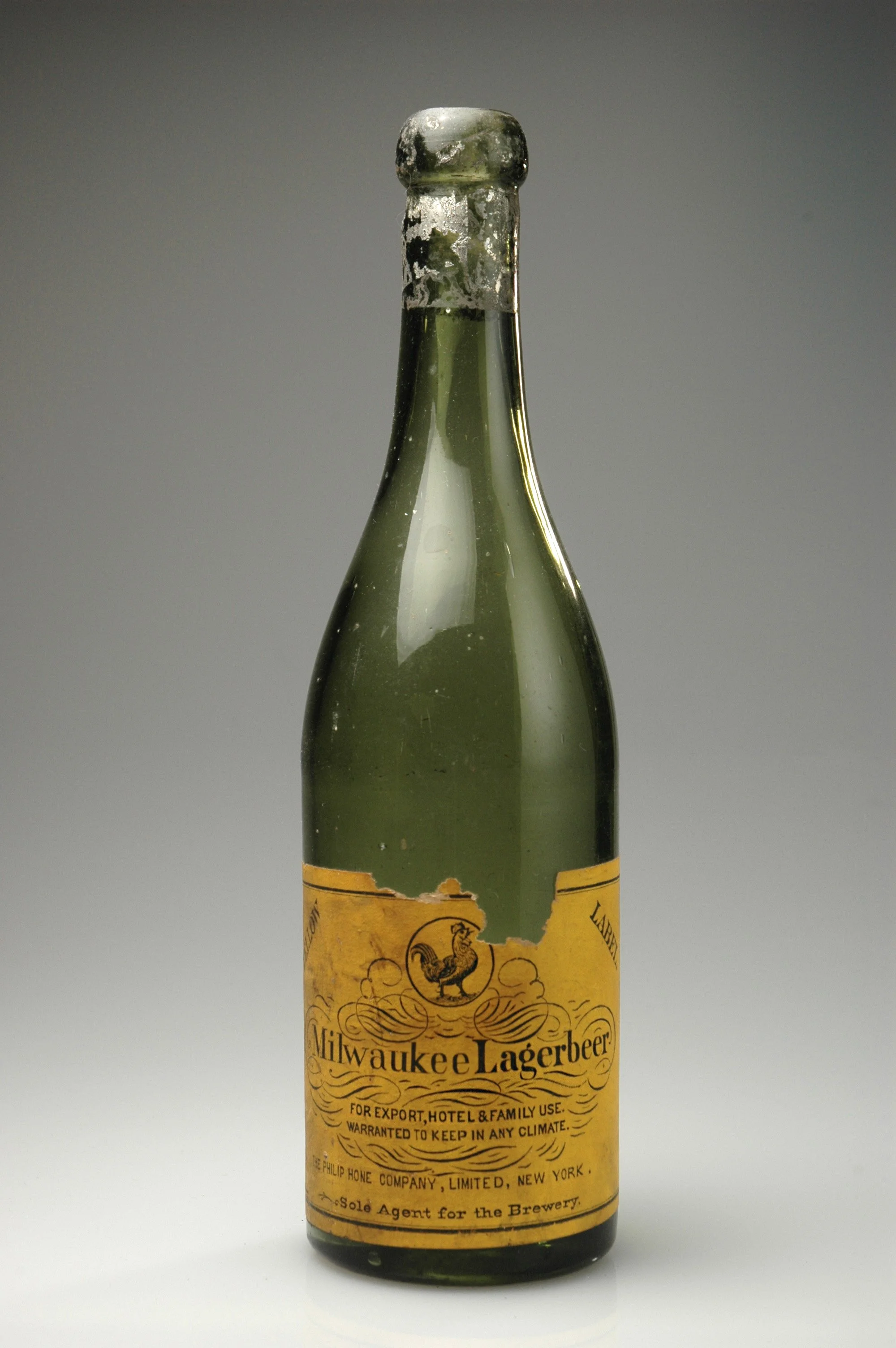
In the 19th century, most beer bottles carried no labels at all. Beer was usually sold by the case directly from breweries, not in shops. To make sure empty bottles found their way back for re-use, breweries embossed their names or logos directly into the glass.
Only the few brands shipped beyond their local markets used paper labels—and most of those designs were simple and functional, not the colorful works we recognize today.
1880–1919, “Pre-Prohibition” or The Rise of the Label
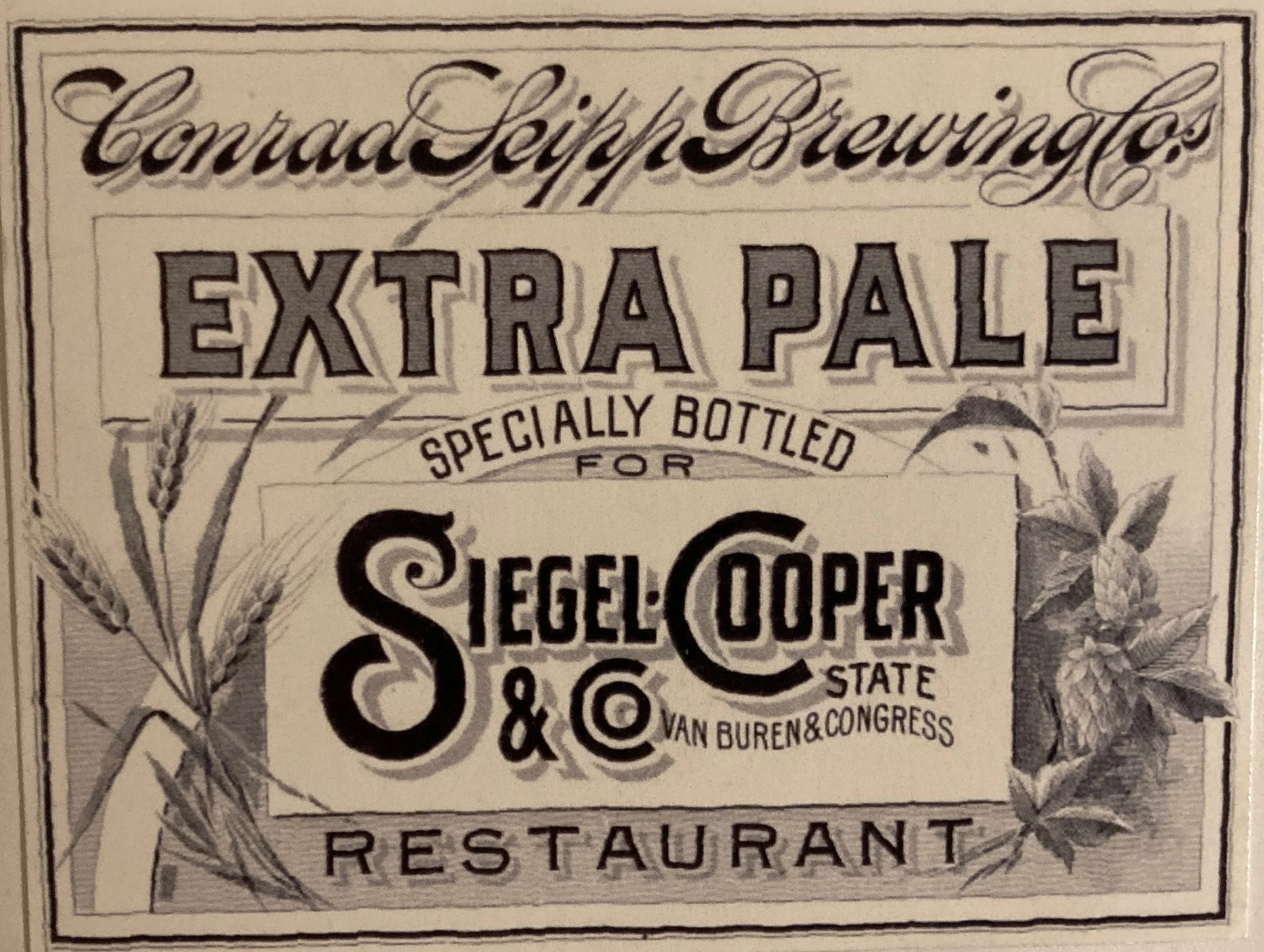
With the spread of stone lithography in the late 19th century, beer labels suddenly burst into color. Polychrome printing made bold, eye-catching designs possible, and a new “gaslight” style layered images and lettering for a rich, dramatic effect.
Most of these labels were created by just one or two generations of commercial artists. Working at actual size—since enlarging technology didn’t yet exist—they produced remarkably intricate designs that are now prized by collectors. For some historic breweries, this look was so iconic it still appears on their labels today.
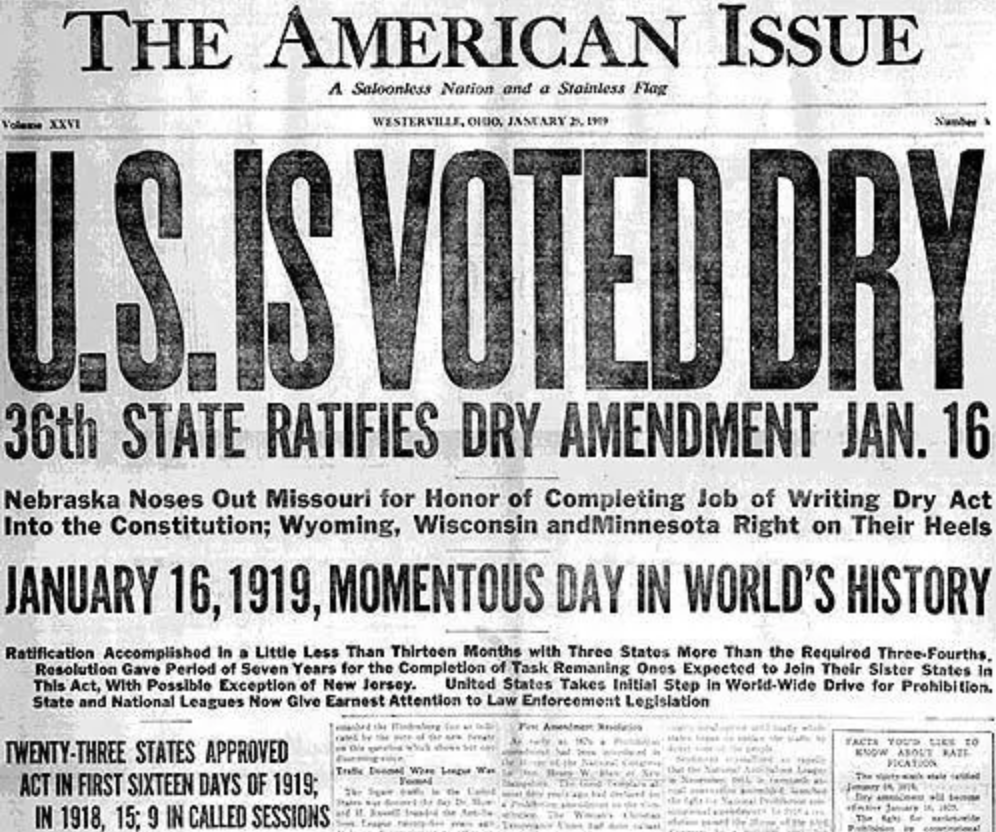
Prohibition: 1919 –1933 or A Missing Chapter
During Prohibition and its aftermath, brewing in Chicago continued on a massive scale. But in an era shaped by scarcity and speakeasies, most people were satisfied just to have beer at all. Gangsters, who controlled much of the trade, weren’t inclined to spend on design or decoration unless absolutely necessary.
As a result, beer label design from this period is surprisingly sparse—despite the fact that two major art movements, Art Nouveau and Art Deco, were flourishing all around it.

Post-Prohibition through WWII: 1933–1950 or Modern Times, Modern Designs
After Prohibition, brewers rushed to stake their place in a world bursting with optimism and progress. The bold geometry of Art Deco—often paired with images of technological marvels—gave beer labels a fresh, modern look.
Some designers blended historic motifs with Deco or streamlined styles, sometimes with striking results, sometimes a little awkward. Others ignored the trend entirely, sticking to familiar older graphics.
This period also marked a change in who beer was for. No longer just marketed to men, beer began to target women as well. Packaging shifted too: the six-pack made it easier to carry beer home, and lightweight cans—first the “cone-top” variety that fit existing bottling machines—offered a quick-chilling, space-saving alternative to heavy returnable bottles.

1950–1972 or The Beer Dessert
The postwar years brought massive consolidation in brewing—and with it, a race to the bottom in price, quality, and design. While modernist design was flourishing in nearly every other industry, it barely touched beer labels. Tradition—sometimes more a marketing pose than reality—still ruled.
Labels grew simpler and cleaner but often lacked real personality or communication.
The upside? This bland landscape set the stage for something
1972 –1995: Early Craft or The Revolution Begins
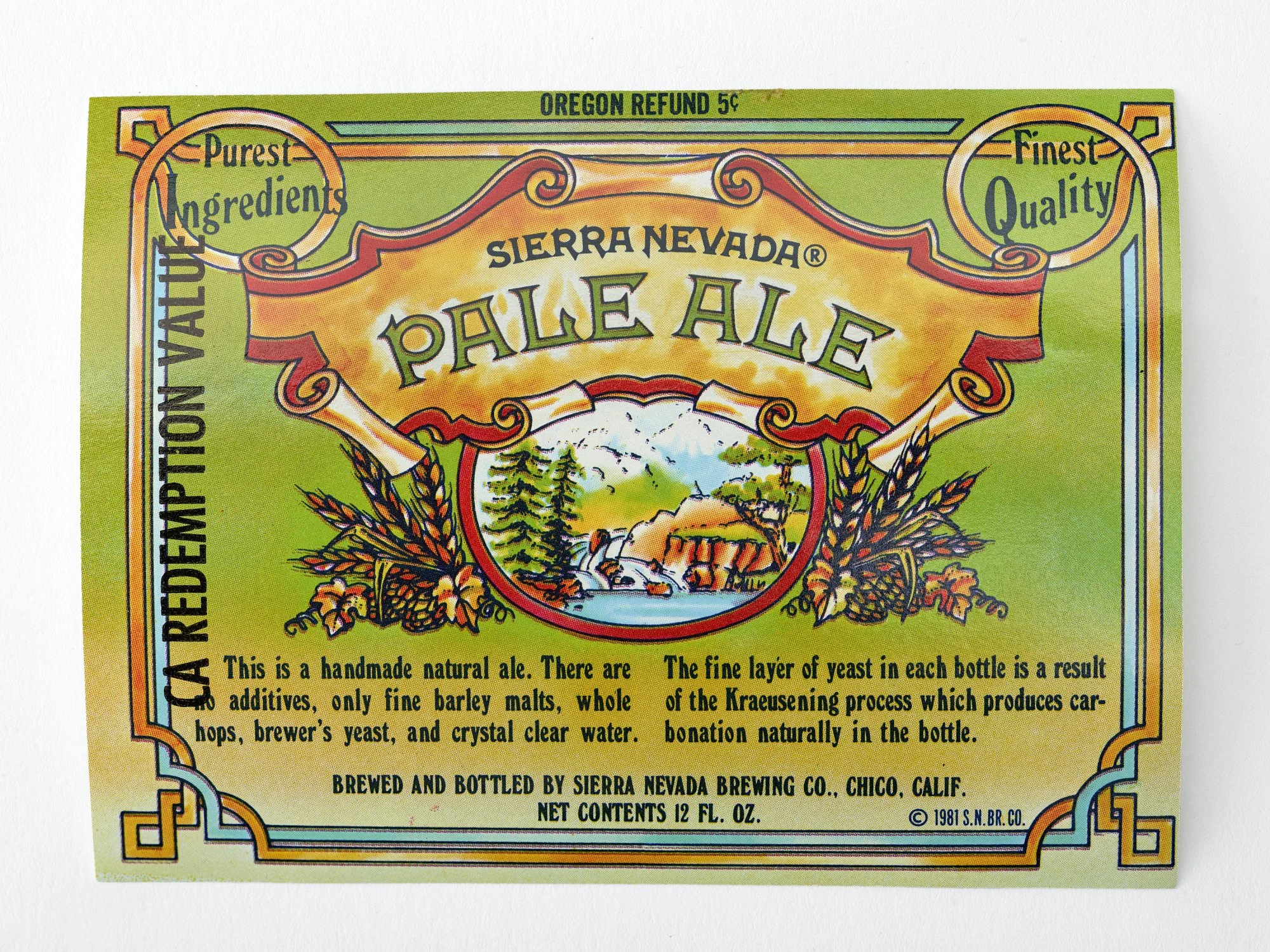
The first wave of craft brewers set out to break from the bland, stripped-down look of mass-market beer. Some drew inspiration from European traditions, while others tapped into the spirit of the 1960s counterculture, which still loomed large in the 1980s.
A formula emerged: name the beer after a local creek, mountain, or landmark, pair it with an animal mascot, and decorate with curly banners, hops, and barley stalks. The results were colorful, lively—and unmistakably different from supermarket brands.
At first, craft beer lived almost entirely in bottles, usually six-packs or oversized 22-ounce “bombers.” Then in 1990, Oskar Blues broke the mold by putting craft beer in cans. By 2025, cans had become the dominant package—lighter, easier to ship, quicker to chill, and a new canvas for bold design.
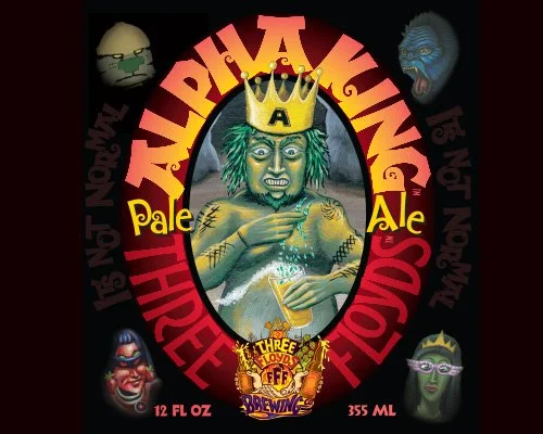
1995 to Present: Craft Goes Wild or Breaking the Rules
As craft beer matured, competition and generational change pushed label design in bold new directions. Alongside more conventional packaging, genuinely sophisticated and adventurous designs began to emerge.
Few pushed this farther than Nick Floyd of Three Floyds Brewing in northern Indiana. Rejecting all the old rules, Floyd filled his labels with the art he loved—fantasy imagery, tattoo-inspired graphics, and wild, freewheeling visuals. His approach opened the door for other brewers to embrace individualistic, artist-driven design, transforming beer packaging into a space for true artistic expression.